From an economic point of view, Chart 1 (in the last blog) is a bit misleading because a dollar in 1975 is worth a lot more than a dollar in 2015, thanks to inflation. To adjust for inflation, we can use a measure of consumer prices. The resulting chart of inflation-adjusted home prices (Chart 2) gives a different picture than Chart 1. You can see that, in inflation-adjusted terms, housing prices grew rapidly in the second half of the 1970s, were fairly stable in the 1980s and early 1990s, and then began rising rapidly again in the second half of the 1990s until 2007. But, beginning early in 2007, inflation-adjusted home prices began to decline substantially. Over the five-year period from the peak in 2006 to their low point in 2012, inflation-adjusted home prices declined an average of 6 percent per year.
The data in Chart 2 can also be used to answer the question: is investing in a home a good financial investment? The answer is a clear NO! Using the data and calculating the inflation-adjusted annual return on homeownership, from 1975 to 2015, home prices rose only 1 percent per year, far less than stocks and bonds over the same period. Even at their peak in 2006, inflation-adjusted home prices had appreciated only 2 percent per year. So, if you buy a home, you are buying it because it provides shelter, not because it is a great financial investment.
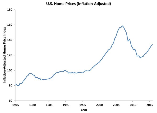
Chart 2: U.S. Home Prices (Inflation-Adjusted)
Source: Federal Housing Finance Agency (FHFA) All-Transactions Home Price Index, rescaled by author and adjusted for inflation using personal consumption expenditures price index from Bureau of Economic Analysis
