Inflation in 2022

How bad is inflation?

Over the last 12 months (January to January), the overall inflation rate (measured using the Consumer Price Index, CPI) was 7.5%. The last time inflation was this high was in 1982, some 40 years ago. Part of the reason for the high rate of inflation is high energy prices. For that reason, and because food prices often cause a temporary spike in inflation, macroeconomists commonly remove food and energy prices from the overall measure to look at a measure of “core” inflation. The graph here shows both overall and core inflation using the CPI. Core inflation was up 6.0% over the past year. Both measures are much higher than they have been at any time in the preceding 20 years, with the previous peaks since 2000 at 5.5% for the overall inflation rate and 2.8% for the core inflation rate.

Inflation since 2000, as measured by the CPI

One important issue in measuring inflation is that the construction of the CPI leads to an upward bias in the inflation rate. The CPI measures the prices of a fixed basket of goods but we know that when prices of some goods go up, people substitute some cheaper goods. The best measure that allows for this substitution effect is through a slightly different measure of prices, known as the personal consumption expenditures price index (PCEPI). Based on a significant amount of research, many macroeconomists believe that the PCEPI is a more accurate measure than the CPI.

Even the PCEPI shows a large increase in inflation in 2021, as the following figure shows. Over the past 12 months to December 2021, the overall PCEPI inflation rate is 5.8% and the core rate is 4.9%. Both are higher than in all the years from 2000 to 2020, which maxed out at 4.1% overall and 2.7% for the core inflation rate.

Inflation since 2000 as measured by the PCEPI

Who is responsible?

Responsibility for the high inflation rate rests with the Federal Reserve. Yes, there have been other factors that caused inflation to rise. Energy prices are much higher, but that doesn’t explain the rise in the core inflation rate. Supply shortages caused by the pandemic have certainly made inflation worse. Because workers were unable to produce enough of certain types of goods in the pandemic, numerous shortages of goods occurred. Shortages of semiconductors led to shortages of final goods, such as automobiles. And when shortages of goods occur but people have a lot of money to spend, the result is that prices rise as people bid for the scarce goods.

Another factor causing inflation is fiscal policy that was geared towards mitigating the impact of the pandemic. In 2020 and 2021, not knowing how damaging the pandemic would be to the economy, the federal government provided income support to many people and business firms around the country, as well as enhancing unemployment insurance. The result was that some people ended up having much higher incomes than before the pandemic, and fewer opportunities to spend their funds. As the impact of the pandemic lessened over time, those people spent more on goods and purchasing financial assets, causing prices to rise across the board. Not only did inflation rise, but the income support provided by the government led to a huge increase in government deficits and the highest level of federal debt to GDP in history since World War II.

Although supply constraints, energy prices, and government policy contributed to inflation, the primary responsibility for inflation lies with the Federal Reserve. The Fed made several key errors over the past two years. First, the Fed treated the pandemic in the same way it did the financial crisis that started in 2008, even though the pandemic had much milder long-term impacts on the economy. The Fed cut interest rates to near zero and did more quantitative easing and other lending than it did in the financial crisis. However, financial markets recovered quickly after the pandemic began, yet the Fed kept pouring money into the economy. Second, the Fed decided to renege on its inflation target of 2%, stating in August 2020 that “following periods when inflation has been running persistently below 2 percent, appropriate monetary policy will likely aim to achieve inflation moderately above 2 percent for some time.” But financial markets care about the future, not the past, so the statement was risky in that it could lead to a change in people’s expectations of inflation. Third, the Fed ignored inflation signals, and continued to insist that it would keep using expansionary monetary policy “until labor market conditions have reached levels consistent with the Committee’s assessments of maximum employment” (July 2021); but inflation was already above 4% and the Fed did nothing.

What is worse than the rise of inflation is the nonchalance that is exhibited by Fed Chair Jay Powell and other policymakers. Powell may go down in history as the worst Fed chair since Arthur Burns, who caused the high inflation of the 1970s. The Fed should have stopped quantitative easing last summer and should already be raising interest rates. Instead, the Fed continues to pump up the money supply by buying more bonds each month and is only considering a small increase in interest rates at its next meeting in March. With the Federal Reserve as the primary culprit in higher inflation, it is surprising that Fed Chair Jay Powell seems a lock for Senate confirmation. I would not be surprised if a number of Senators vote against his confirmation to send a signal to the Fed that it needs to respond more quickly to inflation before it gets out of hand.

How bad will it get?

Forecasters seem to believe that the Fed will get inflation under control eventually. For example, the most recent Survey of Professional Forecasters shows the core PCEPI inflation rate coming in at just 3.1 percent in 2022. But the forecasters have raised their inflation forecast by 0.8 percentage points in the last three months. If the current trajectory of inflation continues, it is a good bet that their forecasts will rise even higher in the next survey.

My own forecast, made several months ago, is that inflation (in the core PCEPI) will come in at 5 percent in 2022. I made that forecast planning on a diminution of supply constraints and a decline in energy prices. But now it is late February, and the supply constraints show no signs of declining, while the Russia-Ukraine conflict is keeping energy prices high. So, given the strong upward trajectory of inflation, I suspect that inflation will come in even higher, and a rate of 6 percent or even 7 percent would not be a surprise.

To put it concisely, inflation is high and rising, and the Federal Reserve is failing in its main mission. The costs to the economy will be substantial.

Forecasting the COVID recession

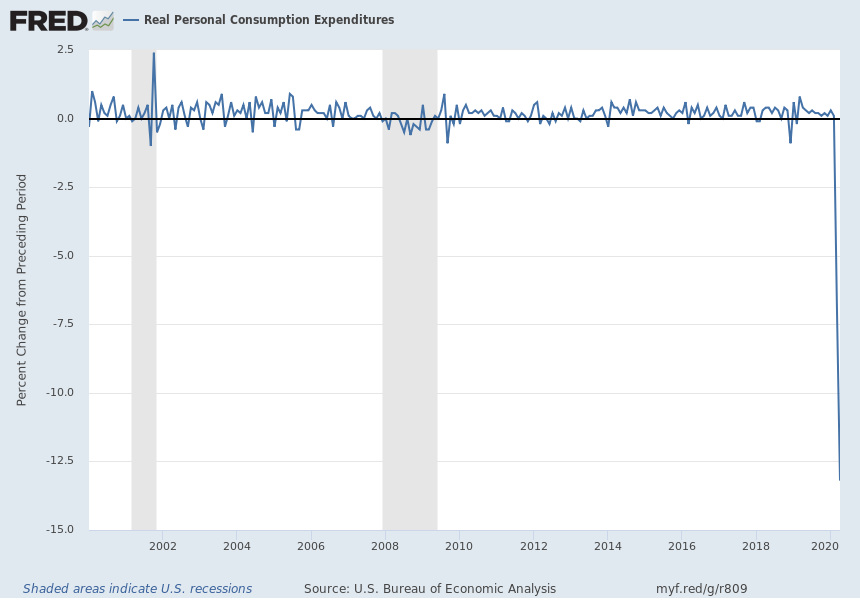
Forecasting the economy is a near impossible task in this recession because the data have no historical precedent. We thought the last recession from 2007 to 2009 was bad; but this one makes the last one look trivial. For example, look at the change in consumer spending in April compared with the change in the past two recessions.

realC

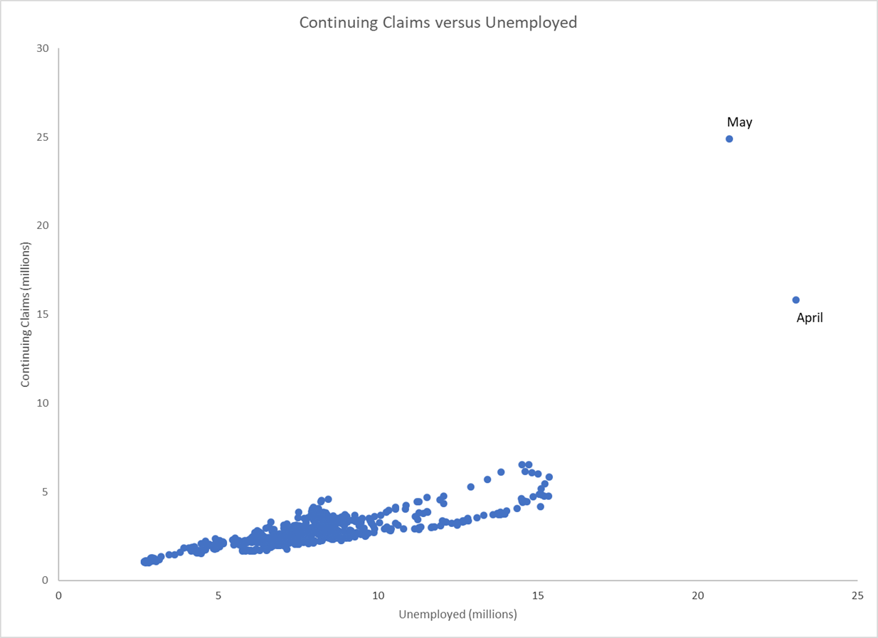
Because of the unprecedented nature of this recession, forecasting is a major challenge. Like many forecasters, my forecasts were far off for the unemployment rate in May. I expected it to be around 22 percent, but it came in just over 13 percent. I based my forecasts on the April number of nearly 15 percent, combined with a huge increase in continuing claims for unemployment insurance. But if you look at the chart comparing the continuing claims to the number of unemployed people, you can see that the numbers are so far out of our historical experience, that our econometric models are not very useful.

CCvsU

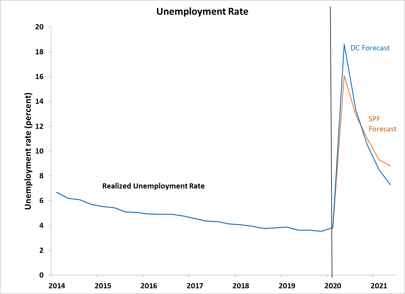
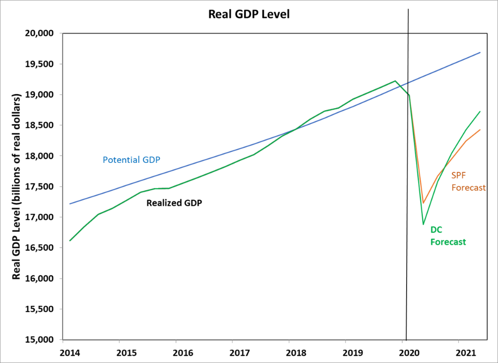
Compared with other forecasters, such as those in the Survey of Professional Forecasters, I am a bit more pessimistic in the short run but more optimistic in the long run, as my initial forecasts of real GDP growth and the unemployment rate suggested.

DCfUR

DCfGDP

These forecasts were made before the May unemployment rate was released in early June. I have subsequently revised down my unemployment rate forecasts but only because I think the BLS has a lot of errors in how people are classified and that they will continue to do so. I think the true unemployment rate is substantially higher than the BLS suggests.

Of course, all economic forecasts depend on the outcomes of the coronavirus, and no one knows how that will turn out. Thus, the error bands around all of these forecasts are much larger than ever before. In fact, my forecast for the personal saving rate in May is 30% plus or minus 20%! That’s because the personal saving rate is measured very badly, on average, and the measurement errors for most variables increase in recessions. I suspect that the data we are seeing now are going to be revised substantially, with revisions that are larger in magnitude than we have ever seen before. So, I would advise being skeptical about all macroeconomic data that you see.

The Political Business Cycle

The President’s recent pressure on the Federal Reserve is a great illustration of why we must have an independent central bank. Every incumbent politician wants the economy to be growing strongly when he or she is seeking reelection. Now, the current President has suddenly realized that he put in place expansionary fiscal policy too early, stimulating the economy in 2018. He would prefer that the economy be growing more rapidly in 2020 when he hopes to be reelected. But the transitory impact of his policies are already wearing off, so of course he wants the Federal Reserve to cut interest rates now and to further stimulate the economy.

Monetary policy works with a lag, with the maximum impact of a policy change on output and employment occurring about one year after a change in interest rates. That means that if the Federal Reserve were to cut interest rates right now, the economy would be heating up next spring and summer, just ahead of the fall elections.

Economists call the relationship between stimulative policies and elections the Political Business Cycle. Since time immemorial, politicians have striven to have macroeconomic policies help their reelection chances. That is one reason that most countries have created independent central banks, so that economic facts, not political desires, determine monetary policy.

Does the economic situation itself call for a cut in interest rates? Although a few weeks ago there was some concern about weakness in the economies of China and Germany, along with an inverted yield curve, the threat of recession seems to have subsided. In fact, this is exactly the wrong time to engage in stimulative monetary policy, as the economy seems very close to full employment, and further stimulus is likely to be inflationary. Should the U.S. labor market continue to do well, with wage pressures increasing, the threat of higher inflation might lead the Federal Reserve to raise interest rates later this year.

Earlier appointments to the Federal Reserve Board by the President were outstanding: Randal Quarles, Richard Clarida, Michelle Bowman, Marvin Goodfriend, and Nellie Liang, although the latter two were not confirmed by the Senate. Now the President is considering the appointment of two people who are totally unqualified for the job, with no expertise in monetary policy, macroeconomics, banking, or finance. This attempt to stack the Fed with political appointees to do the President’s bidding weakens the institution and is evidence of the President’s desire to create a Political Business Cycle. The Senate should refuse to confirm these candidates, to help preserve the Fed’s independence from political manipulation.

The Federal Reserve Must Raise Rates

The Federal Reserve’s credibility requires it to raise interest rates at its meeting this week. The reason is that otherwise it would appear to be giving in to the US President, who has been criticizing the Fed and blaming it for causing financial market turmoil. If the Fed does not raise interest rates in response, the President will have shown that he has power and influence over the Fed. The Fed must prove its independence.

The only justification the Fed could have to not raise interest rates at this meeting would to be a major deterioration in the world economy. There are some indications of weakening in China and Europe but not enough for the Fed to be overly concerned. The Fed has been on a trajectory of gradual tightening to bring monetary policy to a neutral position after a decade of easy money. The Fed needs to continue on this trajectory.

From an economist’s point of view, in fact, it is the President and Congress, not the Fed, that are raising interest rates. The President and Congress are using expansionary fiscal policy, with a large tax cut and increased government spending. As a result, the rapidly growing deficit is leading to higher interest rates, not the Federal Reserve. The government’s borrowing needs are putting pressure on financial markets to absorb more and more debt, which can only happen with higher long-term interest rates. The upward movement of those interest rates then requires the Fed to raise the short-term federal funds rates to keep pace. Failing to do so would lead to the Fed falling behind the curve and to higher future inflation.

Should the Fed not raise interest rates at its meeting this week, its low level of credibility will shrink even more. After the disaster of the Great Recession of 2007 to 2009, the Fed needs to do everything it can to regain the public’s trust. An increase in interest rates would help. If the first quarter inflation numbers rise, as seems likely, the Fed will need to raise interest rates even faster in 2019 than it did in 2018.

Fed Chair Powell may have the respect of economists within the Fed but has no credibility outside the Federal Reserve System. It is time for him to change that.

Why Low Inflation Is Good for You

Fifty years ago, economists didn’t think that inflation caused many economic problems. Then, in the late 1960s and throughout the 1970s, inflation rose to double-digit levels in the United States and many other countries. We learned that the costs of inflation may be significant and that a low inflation rate is ideal.

The problems caused by inflation can be divided into two parts: one based on the level of inflation itself (that is, an inflation rate of 8% is worse than an inflation rate of 2%) and another based on uncertainty about inflation (that is, a situation in which you don’t know if the inflation rate will be 3% or 5% is worse than a situation with a known inflation rate of 4%).

Problems Caused by Inflation

Inflation creates a number of problems for the economy: (1) shoe-leather costs; (2) menu costs; (3) imperfect taxation; and (4) a tilt in mortgage payments.

The first cost of inflation is what economists call shoe-leather costs, which is a euphemism for the costs that society incurs when people go to the bank frequently as they try to keep less cash in their pockets. When inflation occurs, your cash loses value because it earns no interest. If inflation is 10% and you keep $100 in your wallet, on average, you lose $10 each year in purchasing power. To minimize that cost, you might go to the bank more often and keep less cash in your wallet. The cost to individuals is fairly small, but for business firms that might have millions of dollars in cash outstanding, for example at retail stores, these costs can be quite high.

A second important cost of inflation is menu costs. These costs arise because inflation causes firms to have to change their prices frequently. The most obvious cost is for restaurants that may have fancy menus that are expensive to produce. Many other firms face this cost, especially firms that list their prices in large catalogues. Customers don’t like it when prices are constantly changing and firms cannot honor the prices they have printed in their catalogues. This problem is mitigated somewhat if the prices are only shown on the firm’s web site because those prices can be changed quickly, but the problem remains significant for many firms.

The third problem with inflation, which is even more significant, is that our tax system is distorted significantly by the presence of inflation. The higher the inflation rate is, the bigger the distortion is. The cost of a 6% inflation rate is more than twice the cost of a 3% inflation rate. The source of the problem is that the U.S. tax system is based entirely on dollar amounts. But the economic system is based on inflation-adjusted amounts. Those two systems clash strongly when inflation occurs.

Here is an example. Suppose you invest $10,000 in a stock that pays a 5% inflation-adjusted return each year and suppose you are in the 40% tax bracket (combining U.S., state, and local income taxes). If inflation is 0% and the inflation-adjusted return is 5%, then you earn a dollar return of 5% (note that the inflation-adjusted return plus the inflation rate equals the return in terms of dollars, so 5% + 0% = 5%). In dollars, you earn 5% × $10,000 = $500. Your tax will be 40% of the $500 return, which is 0.4 × $500 = $200. So, of the $500 that you earned, you get to keep $300 and the government keeps $200.

But what if the inflation rate is 10%? If you get the same inflation-adjusted return of 5%, the return on your investment is 15% in terms of dollars (5% inflation-adjusted return + 10% inflation = 15% return in dollar terms). In dollar terms, you earn 0.15 × $10,000 = $1,500. Now you are taxed 40% on your dollar return, so you will pay taxes of 0.4 × $1,500 = $600. You earn $900 after taxes and pay $600 in taxes. You might think that is fine, but now calculate how much the value of your stock has declined because of inflation. With a 10% inflation rate, your $10,000 worth of stock is now worth $1,000 less. So, in inflation-adjusted terms, your return is actually negative. In dollar terms, you got a $900 return but the value of your investment fell by $1,000, so your inflation-adjusted return is –$100, or –1%.

Why is your return negative? The main reason is that the government taxed you on the dollar amount of your return, rather than the inflation-adjusted amount of your return. One way to look at it is that of the 15% return in dollar terms that your stock generated, inflation got 10% of it, the government got 6% of it, and you got –1% of it; or in inflation-adjusted terms, the government gets 6% and you get –1% of the total inflation-adjusted return of 5%.

So, the higher inflation is, the more the government gets of your income and the less you get. That’s why sometimes governments create inflation to get out of budget problems—they get much more tax revenue and the inflation-adjusted value of their debt declines.

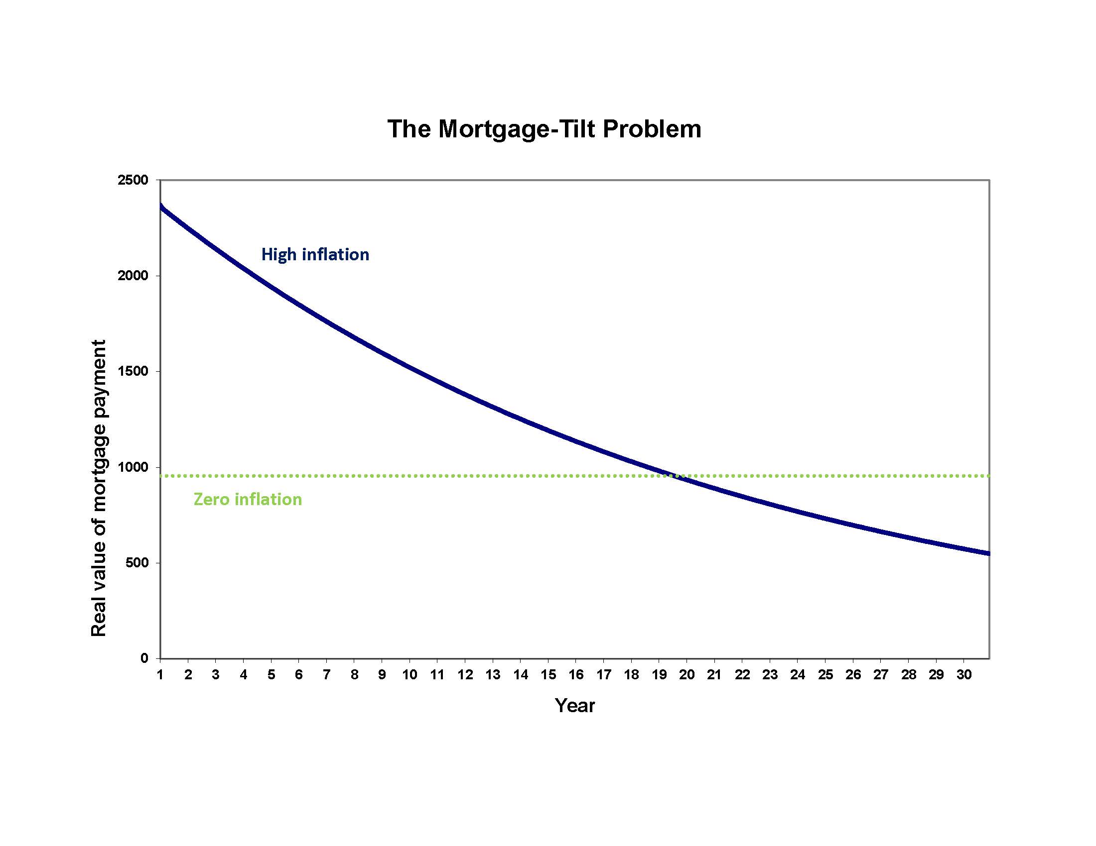
The fourth and final major problem related to inflation is that it distorts people’s mortgage payments. This is another fairly subtle problem that most people don’t realize is happening. The basic idea is that, the higher inflation is, the higher the mortgage interest rate is, and the inflation-adjusted value of your mortgage payment declines over time. This means that it costs you much more in inflation-adjusted terms to pay your mortgage early on and much less later. Here is an example.

Consider two situations, one in which inflation is 0% and one in which the inflation rate is 10%. In the low inflation case, suppose your mortgage interest rate is 4% but in the high inflation case it is 14%, so in both cases the mortgage interest rate equals 4% plus the inflation rate. How much would your monthly payment be on a $200,000 30-year mortgage? If inflation is 0%, your monthly payment would be $954.83. If inflation is 10%, your monthly payment would be $2369.74. Your monthly payment on your mortgage is much higher when inflation is 10% than if inflation is 0%. When you combine this with the fact that to qualify for a mortgage your monthly mortgage and total debt payments must not exceed a certain fraction of your income, you can see that when inflation is high, homebuyers will have to buy smaller homes to keep the monthly payments affordable. This problem is aggravated by the mortgage-tilt problem, which is illustrated in the next chart.

mortgage tilt

Chart: The Mortgage-Tilt Problem

Source: Author’s calculations

As the chart shows, when inflation is zero, the real (inflation-adjusted) value of the monthly mortgage payments is constant over time. But when inflation is high (10% in this case), the monthly payments are tilted; they are high early in the life of the mortgage and lower later in the life of the loan. This mortgage tilt creates a problem because you qualify for a loan based on the initial payment. So, when inflation is high, your mortgage is least affordable in the early years, and much more affordable in the past 10 years. But the result is that you may have to buy a smaller home when inflation is high because of the mortgage-tilt problem.

How to Adjust for Inflation

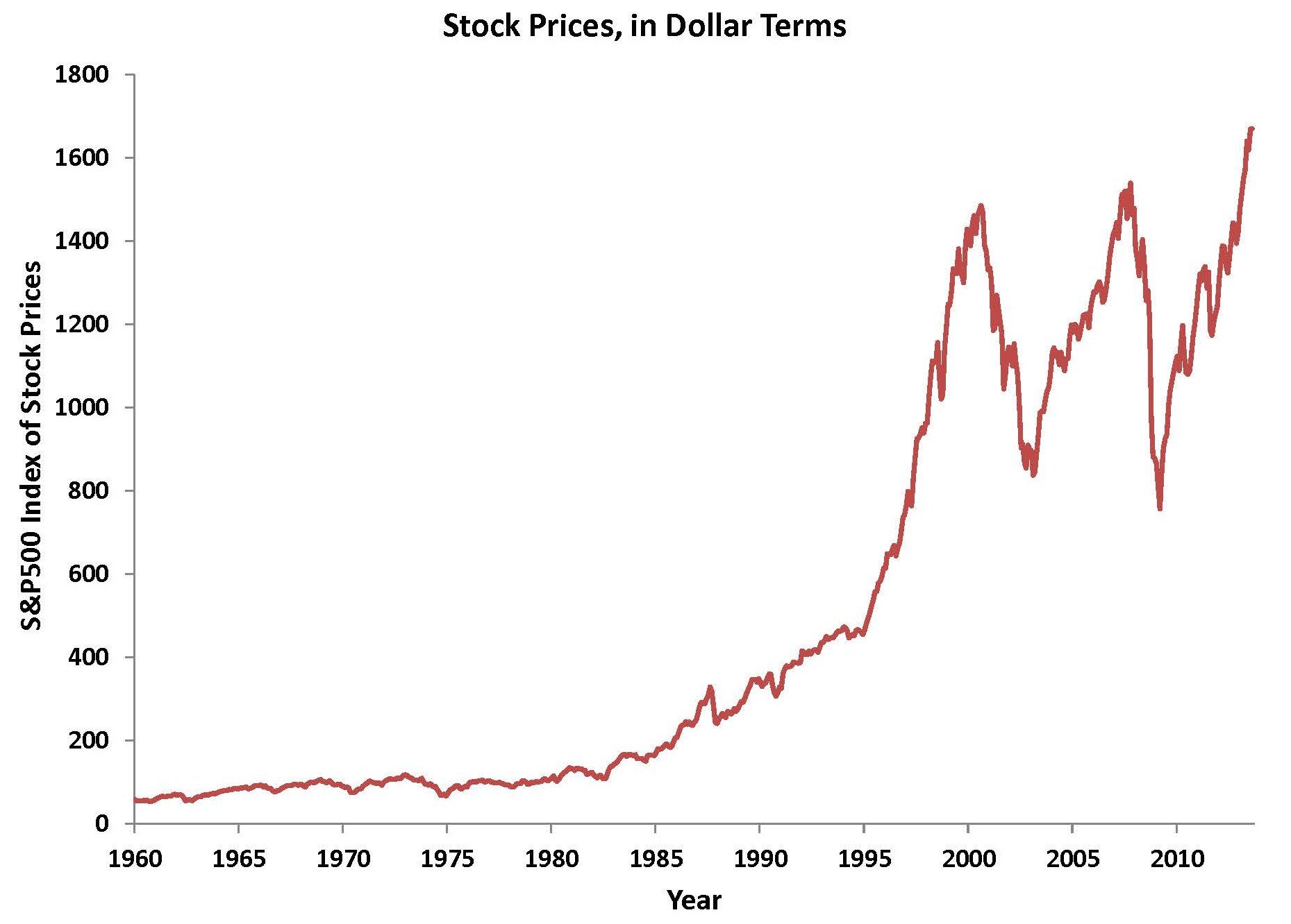
I was teaching a class in April 2013, and I started, as I usually do, by talking about the economic news of the past week and what it meant for the economy. A student said, “I thought the big news of the week was that the stock market had hit a new high level, surpassing the level it had been at before the financial crisis in 2008.” He was excited about that, as were many of the other students, most of whom worked on Wall Street. My reply was depressing to my students, but accurate, as I noted, “Although the news media trumpeted the new level of the stock market, they failed to account for inflation. Once you do that, you’ll see that the market still needs to rise another 7% or so before it is as high as it was in 2008 before the crisis.” I then proceeded to show them how to account for inflation properly, to see economic variables in real, not nominal terms.

The first chart shows a view of the stock market’s value in nominal terms (the dollar value of the market). You can see that in the past 15 years, the market reached local peaks in August 2000, October 2007, and August 2013. Before the financial crisis, in October 2007, the market (measured by the monthly average of the Standard & Poor’s 500 index of stock prices) stood at a level of 1539. As of August 2013, the index was 1670, which is 8% higher than it was in October 2007.

nominal stock prices

Chart: Stock Prices, in Dollar Terms

Source: S&P Dow Jones Indices LLC, S&P 500© [SP500], retrieved from FRED, Federal Reserve Bank of St. Louis; https://fred.stlouisfed.org/series/SP500, May 1, 2017.


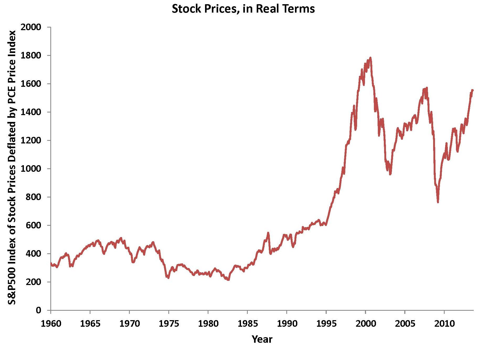
But remember that the dollar doesn’t buy what it used to buy. As we saw earlier, one dollar in 1965 buys the same amount of goods that $6 buys today. To get an accurate picture of the value of the stock market, we must adjust for inflation. The adjustment is not too complicated.  All you have to do is to divide the nominal (dollar) value of the stock market at each date by a measure of prices at that date. Doing so creates a real (inflation adjusted) index of the stock market, as shown in the next chart. To create the chart, I used the personal consumption expenditures price index as my index of inflation.

real stock prices

Chart: Stock Prices, in Real Terms

Source: Author’s calculations using data on S&P 500 Index and PCE price index (Bureau of Economic Analysis)


As you can see in this chart, adjusting for inflation matters a lot. You can see that the peaks in the market that we observed in nominal terms in 2007 and 2013 are well below the real level of the stock market in 2000. And, as of August 2013, the market was still 13% below its level in August 2000, in real terms.

The same idea can be applied in many other ways. Any nominal (dollar-denominated) variable can be adjusted for inflation to put it in real (inflation adjusted) terms. You might think your salary has been growing pretty well over time, but have you adjusted it for inflation? Over the past 16 years, nominal wages and salaries in the United States have gone up 2.7% per year, on average, but most of that rise was just to keep up with inflation. In real terms, wages and salaries have gone up only 0.9%, as inflation in consumer prices has averaged 1.8%. Similarly, we measure total U.S. output with GDP (gross domestic product). GDP has increased 3.8% in the past 16 years, but has increased only 1.8% in real terms (using a measure of inflation based on all prices of goods produced in the United States).

So, be sure to adjust for inflation whenever you are dealing with dollar figures, and don’t be fooled by inflation!

Inflation: The Impact of Food and Energy Prices

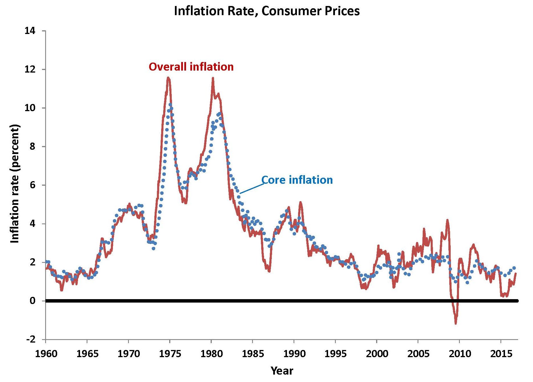
In the short run, oil prices have a major impact on inflation. But it is usually only a short-run effect and on only a few occasions has a spike in oil prices carried over into other prices since 1981. In a few years, a spike in food prices, rather than oil prices, has caused a jump in inflation. One way to see what inflation is doing while abstracting from oil prices and food prices is to calculate the inflation rate based on all goods and services except food and energy prices. This is shown as the dotted line in the chart, labeled “Core inflation”.

overall-versus-core-inflation

Chart: Inflation Rate, Consumer Prices

Source: Author’s calculations, based on Bureau of Economic Analysis data on personal consumption expenditures price index and the same index excluding food and energy prices (core inflation).


You can see immediately that core inflation is much smoother and less volatile than overall inflation. Core inflation is noticeably lower than overall inflation in the years of the oil-price shocks, such as 1974-1975, 1979-1980, and 2004-2005. In a few cases, oil prices declined and you see that core inflation is higher than overall inflation, such as in 1986. You can also see that much of the rise in overall inflation from 2004 to 2008 was driven by increases in food and (especially) energy prices. In a sense, the core inflation measure is the one to focus on because it gives us a better sense of overall inflation, abstracting from short-term shocks to food and energy prices. Although looking at the core inflation rate gets rid of short-term volatility and is thus more useful as an indicator for future inflation, the prices we pay for goods and services are measured by the overall inflation rate, so that’s the one that you want to look at to understand how much the dollar’s value has changed over long periods of time.

Because food and energy prices are so volatile, the policymakers at the Federal Reserve, who are in charge of keeping inflation low and stable, focus mainly on core inflation in setting policy. They know that if they were to respond to every shock up or down in the overall inflation rate, they would be changing interest rates far more often than is warranted. So, although they care about overall inflation in the long run, they know that in the short run their policy actions should be dependent on core inflation, not overall inflation.

Introduction to Inflation

Introduction to Inflation

The value of the dollar has declined dramatically over time thanks to inflation. Inflation is caused when the central bank (the Federal Reserve in the United States) allows the amount of money in circulation to grow too fast, or equivalently, if the central bank sets interest rates too low. Inflation causes the value of your money to decline, so you bear a direct cost. As we will see in my next series of blogs, inflation causes other problems in the economy that are severe, but are not felt directly by most people.


What Does a Dollar Buy Today?

When inflation occurs, prices of goods rise, on average. So, a dollar buys less than it used to buy. How much is a dollar worth today, compared to the past?


It takes this many dollars today          $2         $3      $4       $5       $6

To buy what $1 bought in this year    1985    1978   1974    1970    1965


As the table suggests, a dollar buys nowhere near what it used to. It now takes $6 to buy what $1 bought in 1965.

The data in the table are calculated by the federal government’s Bureau of Economic Analysis and come from a measure of prices called the Personal Consumption Expenditure price index, which shows the average price of goods and services purchased by consumers in the United States. This particular price index is superior to the more common Consumer Price Index, which is biased upwards and constructed in an inefficient manner. Compiling an accurate measure of prices is quite difficult because of changes in the quality of goods and the fact that people change their tastes for different types of goods. The Personal Consumption Expenditure price index that we use in this chapter has fewer problems than any of the various indexes that the government produces.

The price index shows how much the average price of goods and services has changed over time. To get an idea of how much prices have changed in a year, we can calculate the inflation rate as the percentage increase in the price index from one year earlier. The chart below shows the results of this calculation from 1960 to 2016.

inflation_pcepi

Chart: Inflation Rate, Consumer Prices

Source: Author’s calculations, based on Bureau of Economic Analysis data on personal consumption expenditures price index.


In the chart, you can see that inflation in the early 1960s was very low. But inflation began to rise steadily in the late 1960s and into the early 1970s. Then, from 1974 to 1975, inflation jumped to double-digit levels. Inflation dropped for a short time later in the 1970s, but jumped up again in 1979 and 1980. Inflation began to decline in the early 1980s, rose a bit in the late 1980s, and then declined to below 2 percent in the 1990s. The 2000s saw volatility in inflation, though on average inflation remained fairly low. The inflation rate was negative for a short time in 2009, mainly because of a sharp decline in prices during the financial crisis. More recently, the inflation rate has remained below 2 percent, which is sometimes thought to be the optimal rate of inflation (more on that in a future blog).

Adjustable-Rate Mortgages (Part 3)

In the two previous blogs on adjustable-rate mortgages, we discussed various indexes that are used to determine the interest rate on an adjustable-rate mortgage and we compared the interest rates on adjustable-rate mortgages to those on fixed-rate mortgages. In the last blog, we showed a chart that gave you an idea about how to compare the interest rates on the two types of mortgages over time. But it isn’t a very good chart to answer a key question: at any date, would I have been better off with a fixed-rate mortgage or a variable-rate mortgage? That is a more complicated question because it depends, in large part, on how long you plan to keep your house and how expensive it is to refinance your mortgage. Let’s think about two different scenarios and show you when you would have been better off with a fixed-rate mortgage versus a variable-rate mortgage. We’ll compare a fixed-rate mortgage of $100,000 at each date to a variable-rate mortgage in which your index is the one-year constant-maturity Treasury rate with a margin of 2.5 percentage points, with a 2 percentage point annual cap and a 5 percentage point lifetime cap, with a fixed initial teaser rate for 3 years that gives you a 1 percentage point lower initial rate. In scenario A, we’ll assume you keep your home for 10 years; whereas in scenario B, we’ll assume you keep your home for 20 years. If you save money on one mortgage versus the other, we assume that you will invest it in a one-year Treasury security, which has a similar yield to many other safe investment opportunities.

The results, shown in this new chart, are a bit of a surprise because they show that homeowners would have been better off with adjustable-rate mortgages rather than fixed-rate mortgages, if they had bought their houses any time after 1980.

net-profit-for-fixed-vs-adjustable-rate-mortgages

Chart: Net Profit from Adjustable-Rate Mortgage Over Fixed-Rate Mortgage

Source: Author’s calculations, based on Federal Reserve Board data on 1-year constant maturity Treasury interest rate; Federal Reserve Board data on fixed-rate mortgage rate


Here’s how to read the graph. The origination date (when the house was purchased) is shown on the horizontal axis. The vertical axis shows the net profit from having an adjustable-rate mortgage rather than a fixed-rate mortgage, adjusted for inflation, in thousands of dollars. We consider a family keeping a house for 10 years or 20 years. A positive net profit for a line on the graph shows that someone getting a mortgage at the date on the horizontal axis would have been better off with an adjustable-rate mortgage; a negative net profit means the person would have been better off with a fixed-rate mortgage.

You can see that the turning point is the period when inflation was at its highest, in about 1980. Anyone who got a mortgage before that date would have been better off with a fixed-rate mortgage. For example, a family that took out a mortgage loan in 1973, stayed in its house for 20 years, and had a fixed-rate mortgage, would have been $200,000 better off in 1993 than a similar family that had an adjustable-rate mortgage. But starting in 1980, which is the period in which the inflation rate peaks and then begins to decline, an adjustable-rate mortgage gives a net profit over a fixed-rate mortgage. For example, a family that took out a $100,000 mortgage in 1981, stayed in its house for 20 years, and had an adjustable-rate mortgage, would have been $280,000 better off in 2001 than a family that had a fixed-rate mortgage.

However, once we get into more recent periods, we see a pattern that is not surprising: adjustable-rate mortgages provide a small net profit over fixed-rate mortgages. This is not surprising because an adjustable-rate mortgage is riskier than a fixed-rate mortgage to the homeowner. The compensation for taking such a risk is the net profit. So, here is the bottom line: you can save money, on average, by getting an adjustable-rate mortgage, but it is riskier than having a fixed-rate mortgage. If the inflation rate increases after you get your mortgage, which is the main factor raising mortgage interest rates, then you will be better off with a fixed-rate mortgage. That’s the result we see in the chart for mortgages that were originated in the 1970s. But, if the inflation rate stays the same or decreases after you get your mortgage, then you will be better off with an adjustable-rate mortgage.

In recent years, the Federal Reserve has committed to keeping the inflation rate low and stable, as we will discuss in a later blog. If you believe that their commitment is credible, then you may want to get an adjustable-rate mortgage. But you must be aware of the risk that your monthly payment could rise. If your budget is tight, you will probably be better off with a fixed-rate mortgage to avoid that risk. And the net profit from having an adjustable-rate mortgage stayed pretty low for mortgages originated in the 1990s and early 2000s, so the cost of having a fixed-rate mortgage instead of an adjustable-rate mortgage is not great.

Refinancing

The analysis that we discussed above is not entirely foolproof because it did not consider the possibility of refinancing a mortgage. Had you taken out a fixed-rate mortgage in 1981, for example, you most likely would have refinanced it a few years later when interest rates declined. So, one additional consideration that we did not account for in the chart was the likelihood that someone would refinance. Thus, the net profits plotted in the chart are higher than would actually be the case. Still, the chart shows you the net profit if you never refinanced your mortgage. Of course, refinancing can be expensive, but should certainly be done if you have a fixed-rate mortgage at a high rate and you can lower your rate and your monthly payment.

Predicting Interest Rates

You might think that one way to choose between getting an adjustable-rate mortgage or a fixed-rate mortgage is just a matter of forecasting interest rates. In fact, if you could forecast interest rates better than other people, you could make a good choice. But remember that lenders are also forecasting interest rates. Unfortunately for both lenders and borrowers, interest rates are extremely difficult to forecast more than a year or two ahead, which is much too short a time to be of value in choosing a 30-year mortgage.

Adjustable-Rate Mortgages (Part 2)

In the previous blog on adjustable-rate mortgages, we discussed various indexes that are used to determine the interest rate on an adjustable-rate mortgage. But there is also a second piece of information that determines the interest rate on your loan: the margin. If you add the margin to the index rate, that is your mortgage interest rate. A typical margin is about 2.5 percent, though lenders may require a higher margin if your credit rating is poor. (Your credit rating depends on your past history of making payments on time on your loans, the size of your loan balances, your ability to pay, and so on. We’ll talk more about credit ratings in a future blog.)

Here is an example of how your interest rate is determined. Suppose your index rate is the one-year constant maturity rate, which is currently 0.5 percent. Suppose you have a margin of 2.5 percent. Then your mortgage interest rate is 0.5% + 2.5% = 3.0%. A typical adjustable-rate mortgage adjusts your interest rate once each year and your new monthly payment is based on that new rate.

There are some other factors to consider in choosing an adjustable-rate mortgage or a fixed-rate mortgage. First, many lenders will offer you a lower initial interest rate for a year or two on an adjustable-rate mortgage, which is sometimes called a “teaser” rate. Don’t be teased! For example, suppose your interest rate based on the formula in the preceding paragraph is 3.0 percent but your bank offers you a three-year teaser rate of 1.5 percent. Should you take it? The 1.5 percent rate for three years can save you a lot of money, but remember that you have another 27 years to pay. So, don’t be fooled by the initial low rate. You should figure out whether you can afford the loan based on the regular interest rate of 3.0 percent, as well as considering what might happen if the interest rate rises to an even higher level.

The second additional factor to consider is whether or not there are caps on the interest-rate adjustment. Although the basic formula for your interest rate each year is interest-rate = index rate + margin, sometimes interest rates rise (or fall) by 3 or 4 percentage points within a year. This can dramatically change your monthly mortgage payments. To reduce the risk of a very large change in the monthly mortgage payment that a homeowner might find difficult to handle, many loans have a built-in mechanism that: (1) keeps the interest rate from changing too much year to year and (2) keeps the interest rate from changing too much over the life of the loan. For example, a mortgage loan might have an annual cap of 2 percentage points and a lifetime cap of 5 percentage points. Then your rate would rise or fall at most by 2 percentage points each year and could never be more than 5 percentage points higher or lower than the initial interest rate.

Here is the difficult, but interesting part: at what times in the past would you have been better off with a fixed-rate mortgage as compared with an adjustable-rate mortgage? This is a very complicated calculation because each year the adjustable rate changes by an amount that is subject to the annual and lifetime caps. It’s also complicated by the fact that you could refinance your mortgage for a fee that usually amounts to one to two percentage points of the value of your mortgage. So, let’s just look first at a comparison of the interest-rate on a fixed-rate mortgage each month, compared with an adjustable-rate mortgage on the same date, where we will assume the adjustable rate is determined by the one-year Treasury constant maturity interest rate plus 2.5 percentage points. This will give you an idea of how variable the adjustable rate is compared with a fixed rate. The results are shown in the chart.

The chart shows you that adjustable rates and fixed rates move closely together. The adjustable rates change more from year to year. On average, the difference between the two is 0.4 percentage points—on average, adjustable rates are lower. That is logical because with an adjustable rate, you are bearing some of the risk of a change in market interest rates and the bank bears less risk; so, you are rewarded with a lower interest rate, on average. The other idea that you can get from the chart is that when interest rates are temporarily high, you are better off with an adjustable rate rather than a fixed rate because you will benefit when interest rates decline. When interest rates are temporarily low, you are better off with a fixed rate because you lock in the low rate.


arms-vs-frms

Chart: Comparing Fixed-Rate to Adjustable-Rate Mortgages

Source: Author’s calculations, adding 2.5% to Federal Reserve Board data on 1-year constant maturity Treasury interest rate; Federal Reserve Board data on fixed-rate mortgage rate