I was teaching a class in April 2013, and I started, as I usually do, by talking about the economic news of the past week and what it meant for the economy. A student said, “I thought the big news of the week was that the stock market had hit a new high level, surpassing the level it had been at before the financial crisis in 2008.” He was excited about that, as were many of the other students, most of whom worked on Wall Street. My reply was depressing to my students, but accurate, as I noted, “Although the news media trumpeted the new level of the stock market, they failed to account for inflation. Once you do that, you’ll see that the market still needs to rise another 7% or so before it is as high as it was in 2008 before the crisis.” I then proceeded to show them how to account for inflation properly, to see economic variables in real, not nominal terms.
The first chart shows a view of the stock market’s value in nominal terms (the dollar value of the market). You can see that in the past 15 years, the market reached local peaks in August 2000, October 2007, and August 2013. Before the financial crisis, in October 2007, the market (measured by the monthly average of the Standard & Poor’s 500 index of stock prices) stood at a level of 1539. As of August 2013, the index was 1670, which is 8% higher than it was in October 2007.

Chart: Stock Prices, in Dollar Terms
Source: S&P Dow Jones Indices LLC, S&P 500© [SP500], retrieved from FRED, Federal Reserve Bank of St. Louis; https://fred.stlouisfed.org/series/SP500, May 1, 2017.
But remember that the dollar doesn’t buy what it used to buy. As we saw earlier, one dollar in 1965 buys the same amount of goods that $6 buys today. To get an accurate picture of the value of the stock market, we must adjust for inflation. The adjustment is not too complicated. All you have to do is to divide the nominal (dollar) value of the stock market at each date by a measure of prices at that date. Doing so creates a real (inflation adjusted) index of the stock market, as shown in the next chart. To create the chart, I used the personal consumption expenditures price index as my index of inflation.
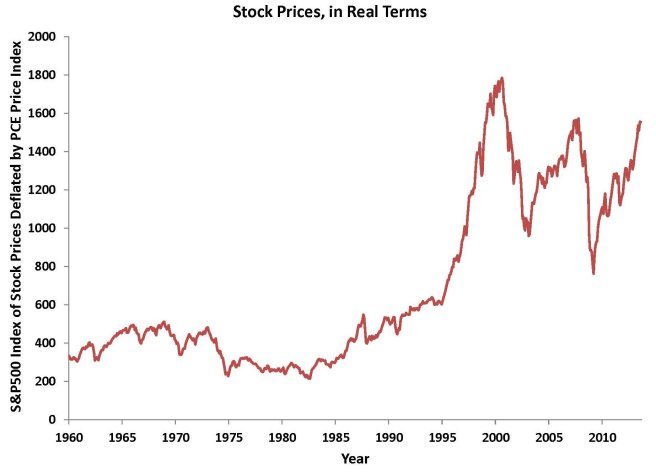
Chart: Stock Prices, in Real Terms
Source: Author’s calculations using data on S&P 500 Index and PCE price index (Bureau of Economic Analysis)
As you can see in this chart, adjusting for inflation matters a lot. You can see that the peaks in the market that we observed in nominal terms in 2007 and 2013 are well below the real level of the stock market in 2000. And, as of August 2013, the market was still 13% below its level in August 2000, in real terms.
The same idea can be applied in many other ways. Any nominal (dollar-denominated) variable can be adjusted for inflation to put it in real (inflation adjusted) terms. You might think your salary has been growing pretty well over time, but have you adjusted it for inflation? Over the past 16 years, nominal wages and salaries in the United States have gone up 2.7% per year, on average, but most of that rise was just to keep up with inflation. In real terms, wages and salaries have gone up only 0.9%, as inflation in consumer prices has averaged 1.8%. Similarly, we measure total U.S. output with GDP (gross domestic product). GDP has increased 3.8% in the past 16 years, but has increased only 1.8% in real terms (using a measure of inflation based on all prices of goods produced in the United States).
So, be sure to adjust for inflation whenever you are dealing with dollar figures, and don’t be fooled by inflation!
